UI Kit
Summary of all styles and components
(
1.
)
Typography
In the project we used two open source typefaces. Bricolage Grotesque and Roboto Serif. Both of those font families are free for commercial use.
Bricolage Grotesque
Font weight: ExtraBold 800
https://fonts.google.com/specimen/Bricolage+Grotesque/about
Roboto Serif
Font weight: ExtraLight 200
https://fonts.google.com/specimen/Roboto+Serif/about
Display
Display 1
Display 2
Display 3
Display 4
Heading
Heading 1
Heading 2
Heading 3
Heading 4
Heading 5
Heading 6
Paragraph
Paragraph
Paragraph italic
Paragraph pre-title
Paragraph leyend
Stories typography
Heading Article
(
2.
)
Logo
Adaptable logo with modern typefaces for a cohesive and recognizable visual identity across all platforms.
Color · Small in header
(
3.
)
Colors
Colours are easily changeble from styles panel in Framer.
Black color - Black
#212121
Dark grey color - Dark Grey
#2C2C2A
Light grey color - Light Grey
#F0F0F0
White background color - White
#FFFFFF
Accent color - Light Blue
#3986A5
(
4.
)
Decorations
SVG illustrations for text underlines and highlights, enhancing website visuals.
Undeline decoration - Type 1
Undeline decoration - Type 2
Undeline decoration - Type 3
Highlight - Type 1
(
5.
)
Arrows
Customizable arrow icons for intuitive navigation and interactive elements, enhancing user experience.
General components
Summary of all styles and components
(
1.
)
Navbar
Streamlined navbar for easy navigation, fully responsive and customizable to fit your website's unique style.
Two deployment variations of this component exist, catering to different screen types.
This section displays the mobile version.
(
2.
)
Cookie settings
Customizable module for users to manage cookie preferences, enhancing privacy and compliance.
(
3.
)
Footer
Customizable footer with dynamic links and information blocks, ensuring a cohesive end to your web pages.
Three deployment variations of this component exist, catering to different screen types.
This section displays the Tablet version.
Custom components
Summary of all styles and components
(
1
)
Loader
This is an animated loader. You can update it in components.

(
2.
)
Highlight Float Card
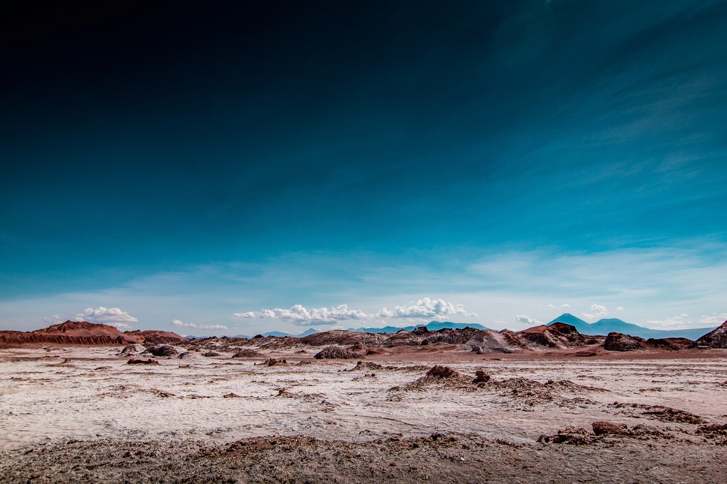
Floating cards featuring country images and key fund insights, creating an engaging visual storytelling experience.
Two deployment variations of this component exist, catering to different screen types.
This section displays the desktop version.
Highlight Float Card
(
3.
)
FAQ
Interactive FAQ component for quick answers to common questions, improving user engagement and support.
FAQ - Items
(
4.
)
Storytelling Steps
Step-by-step frames with graphics, titles, and text for illustrating the fund's mission journey, enhancing narrative clarity.
Two deployment variations of this component exist, catering to different screen types.
This section displays the mobile version.
Storytelling Steps
(
5.
)
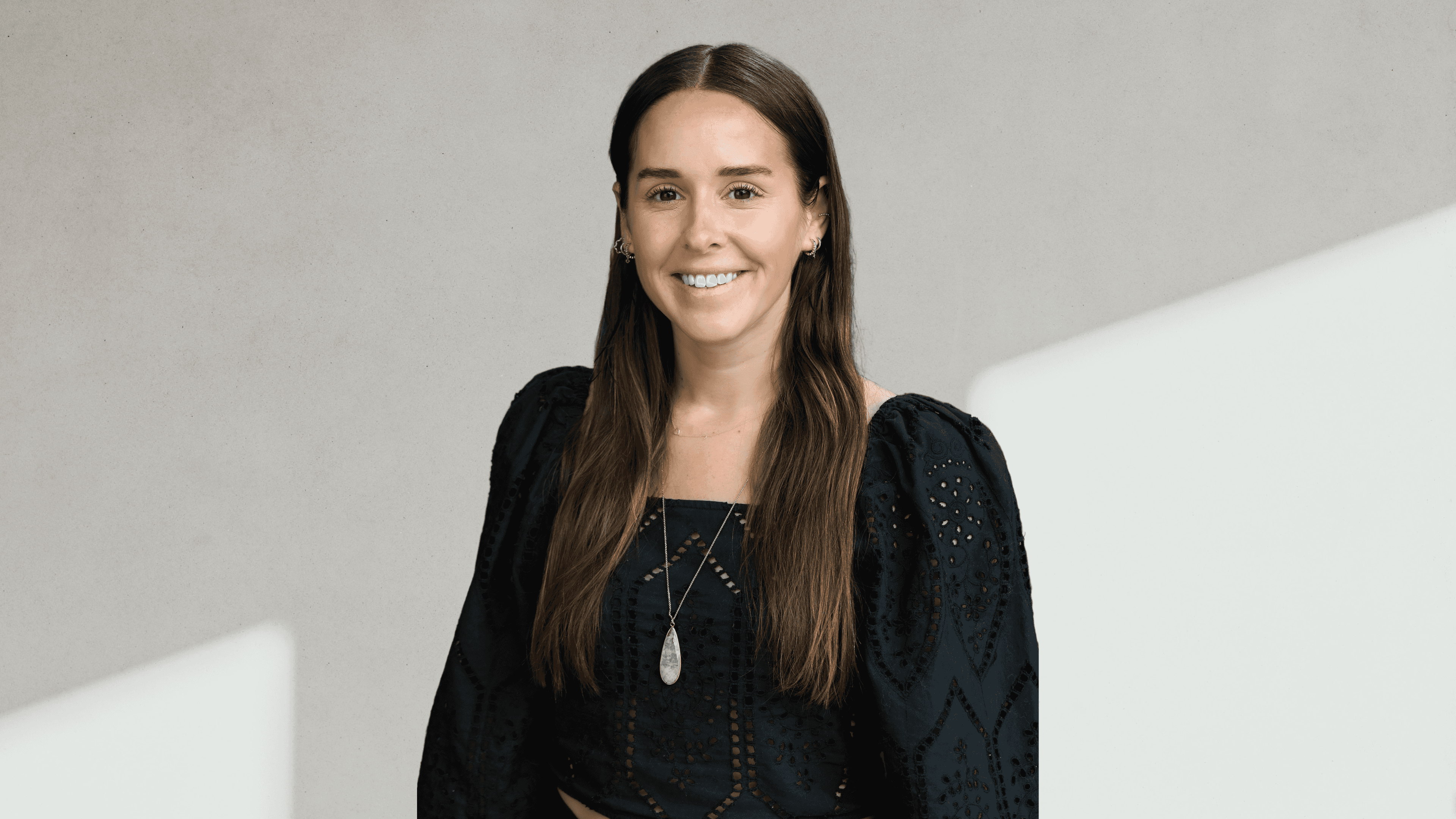
Core-team card
Cards showcasing core team members with bio and role information, fostering trust and team transparency.
Three deployment variations of this component exist, catering to different screen types.
This section displays the Small version.
Core-team card


(
6.
)
Team card
Team cards displaying all fund members, designed to promote team unity and individual expertise.
Two deployment variations of this component exist, catering to different screen types.
This section displays the Default version.
Team card